Last-Call Visual? Why Fans Are Calling the Poster for UFC 323 a Miss
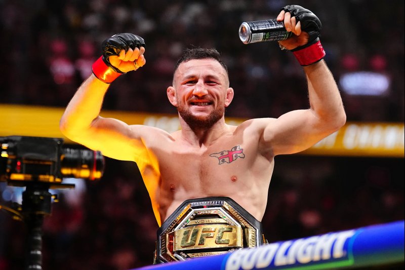
When the promotion for the upcoming December 6 event in Las Vegas finally revealed the official poster for UFC 323 — headlining a much-anticipated rematch of Merab Dvalishvili vs. Petr Yan — some fans quickly hit the brakes. With the stacked card on paper, expectations were high. Yet the reaction to the visual dropped for the show was… lukewarm.
It’s not that die-hard fight-fans don’t care about poster art. In fact, many have voiced outright disappointment: “Worst poster ever,” someone posted. Another wrote, “Too lazy to edit the rejected gloves out?” Yet others took a more neutral tone: “This poster is nice I don’t get the hate.” But the majority of commentary leaned toward frustration.
One of the biggest complaints? Familiarity. The same layout, color palette, and athlete positioning have popped up on multiple recent UFC pay-per-view posters: UFC 314, 315, 316, 320… and now 323. “They keep rehashing the same poster style… all have been the same poster lmao,” one user noted. The feeling: when you’ve done it a dozen times, it loses punch.
That’s especially true when you consider what’s at stake. For fight buffs, UFC 323 isn’t just another event; it symbolically stands as the final pay-per-view in the current format. With major changes scheduled for 2026, this is the last of its kind. That would seem to call for something memorable. Instead, fans argue that the promo image doesn’t match the energy of the card.
Yes, some defenders of the design chime in: “Sick poster!!!” was among the comments. And to be fair, the focus for many is the fights themselves, not the marketing collateral. But when the leading visual fails to connect, it casts a shadow — especially on a show that’s meant to close a chapter for the promotion.
From the layout to the fonts, critics argue that the poster leans too safe, too easy. No flourish. No new direction. In a year where fans have already observed a trend of “basic designs without any real pizzazz or eye-catching artwork,” this one may have hit the tipping point.
With a marquee rematch topping the bill and a title change looming for the promotion’s PPV model, this moment had potential. Instead, the visual flopped into the background. And that’s what has rankled: when expectation meets execution, and the gap becomes obvious.
What remains now is how the show itself performs. If the action inside the cage blows up, the poster will fade into memory. But if it doesn’t, the image could become a symbol of mis-matched hype and under-whelm. For the fans who share their voices online — especially those who say this could be the brand’s last PPV poster ever — that’s a bitter pill. And for UFC 323, the fight may not be the only thing under pressure.


Login with Email or Google
Be the first to comment!